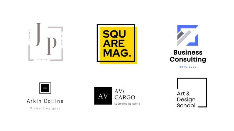
Why A Simple Logo Is Right For Your Business
When you’re trying to design a logo, it’s easy to be caught up in the moment and add too many elements, crazy colors, and a foolish font that’s hard to read. The result is often a complex mess. The truth is, a simple logo can cut through all the noise and show off your brand’s true essence which is super important to the growth of your business.
Having a strong brand is crucial if you want to survive. A great, simple logo design that responds with your audience and forms a connection with them will help separate you from the competition. A simple logo allows you to make more of an impact than a logo that’s jam-packed with imagery and color because it allows you to quickly communicate your brand’s message and character.
So, let’s talk about what goes into a simple logo design and some examples of famous brands with simple logos.
When it comes to logo design, sometimes less is better. Think of design concepts like minimalism and negative space; minimalist logos, like flat logo design, use a single, versatile design that can be applied across backgrounds and mediums. Simple logos are often just wordmarks (i.e. a business name without any imagery), or designs that use a very simple icon.
With that said, if you want your logo to make an impact, there are other fundamental principles you need to follow:
- It should be memorable, so your audience won’t forget your brand in a hurry
- It should resonate with your audience, meaning it has a specific style that THEY find attractive
- It can be used it in a wide range of formats, like digital advertising or printed out on physical items
- It should reinforce your brand’s character and message to help make a connection with your audience
On that note, let’s take a look at some examples of world-leading brands that use simple logo designs to great effect.
A wordmark is the easiest way
Creating a wordmark like Google or Coca-Cola places all of the focus on the text. This means you only need to worry about using an appropriate font and color scheme. With so many choices available, it’s easy to create something eye-catching, that resonates with your audience, and is also unique.
Other impressive wordmark logos include Disney, Philips, and The New York Times.
Use shapes to make your point
Geometric shapes like circles and squares are a great way to push your brand message with a logo. It can help highlight your values and set the scene for your brand’s character.
Circles – These round shapes are associated with movement and transformation. It’s also a great shape for brands that want to promote unity.

Square – If you want to convey a feeling of professionalism and reliability, you can’t go wrong with a square shape. Its shape is inherently solid, and audiences view squares as stable and as a strong foundation.

Triangle – Triangles are more agile than squares and circles. You can point your triangle in different directions, which creates different meanings or places the focus somewhere specific. For example, a triangle on its side represents the ‘play’ button, or ‘go’.
Also, triangles are often associated with inspiration and movement.

Don’t be afraid to explore other geometric shapes like octagons and hexagons. Just remember to keep your overall design clean and simple.
Limit your use of colors
When it comes to creating a color scheme for your simple logo, remember that less is more.
Stick to 1-2 colors, and ensure that each one has a specific meaning and use in your logo. Ensure your logo is easy to see—like the London Underground logo—with bold contrasts or eye-catching complements.
To quickly recap, there are many great benefits if you choose to use a simple logo for your business. Instead of creating a complex design that is hard to see and understand, go for a simple logo that can be memorable, eye-catching, and impactful.


